![[logosignet.svg]](https://blooniverse.com/assets/logosignet.svg)
Bitcoin conquers multi-year 20K-downtrendline
: Holistic market analysis incl. multiple models, timeframes, exchanges
 [FA]
The beauty of FA (fundamental analysis) lies in its strength to visualise long-term trends. Some might also call this examination of the Bitcoin network: on-chain analysis or
data science. Any other public network of nodes would technically work too, if it wasn‘t for Bitcoin‘s overall market dominance.
[FA]
The beauty of FA (fundamental analysis) lies in its strength to visualise long-term trends. Some might also call this examination of the Bitcoin network: on-chain analysis or
data science. Any other public network of nodes would technically work too, if it wasn‘t for Bitcoin‘s overall market dominance.
TA (technical analysis of classical price action) charts do follow network activity – this shall be the conjecture of this article. FA leads TA, certainly in the long run.
In an attempted, but unfinalised assessment from 25. July the reader would also come across a reference to the term DeFi (decentral finance) and its fundamental influence on a coin's price resp. a chain's market valuation. The assumption here was that money of any kind – last millenium‘s or the new digital one aka magic internet money – would go where most substance and value can be found.
 [FA]
Whereas above's model visualisation merely shows the projected price top and calculated bottom of the cryptocurrency Bitcoin, the second FA chart clearly looks too crowded.
[FA]
Whereas above's model visualisation merely shows the projected price top and calculated bottom of the cryptocurrency Bitcoin, the second FA chart clearly looks too crowded.
A healthy middle way described in more detail in the paragraph and model visualisation below should allow any person, financially savy or not, to quickly gain fundamental orientation. Such orientation is pivotal in extremely volatile markets like the cryptocurrency market. Once more, there is no certainty: even models based on real network activity should always be srutinized carefully and assessed prudently according to one's individual risk management.
However, objective orientation on data seems axiomatically preferrable over emotional action resp. over-reaction (e.g. greed-based FOMO aka fear of missing out) or blind ignorance.
 [FA]
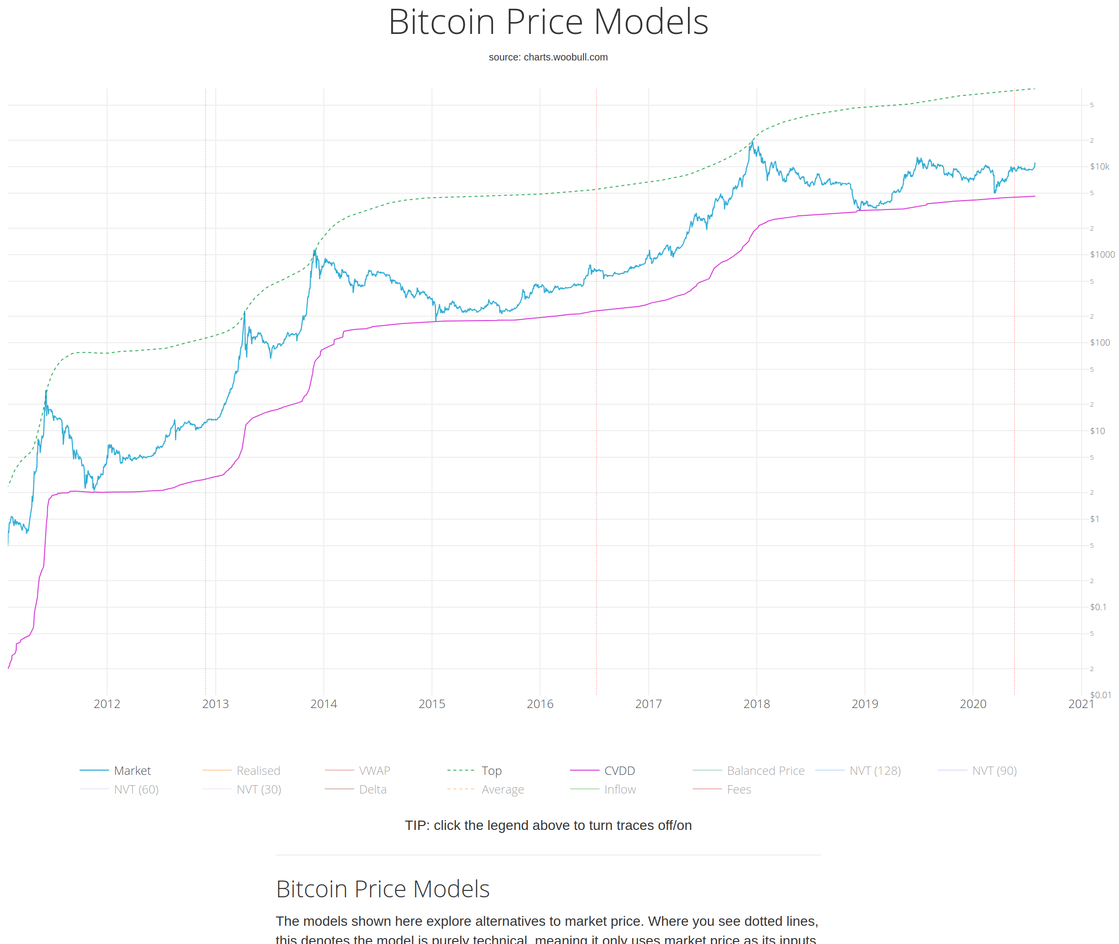
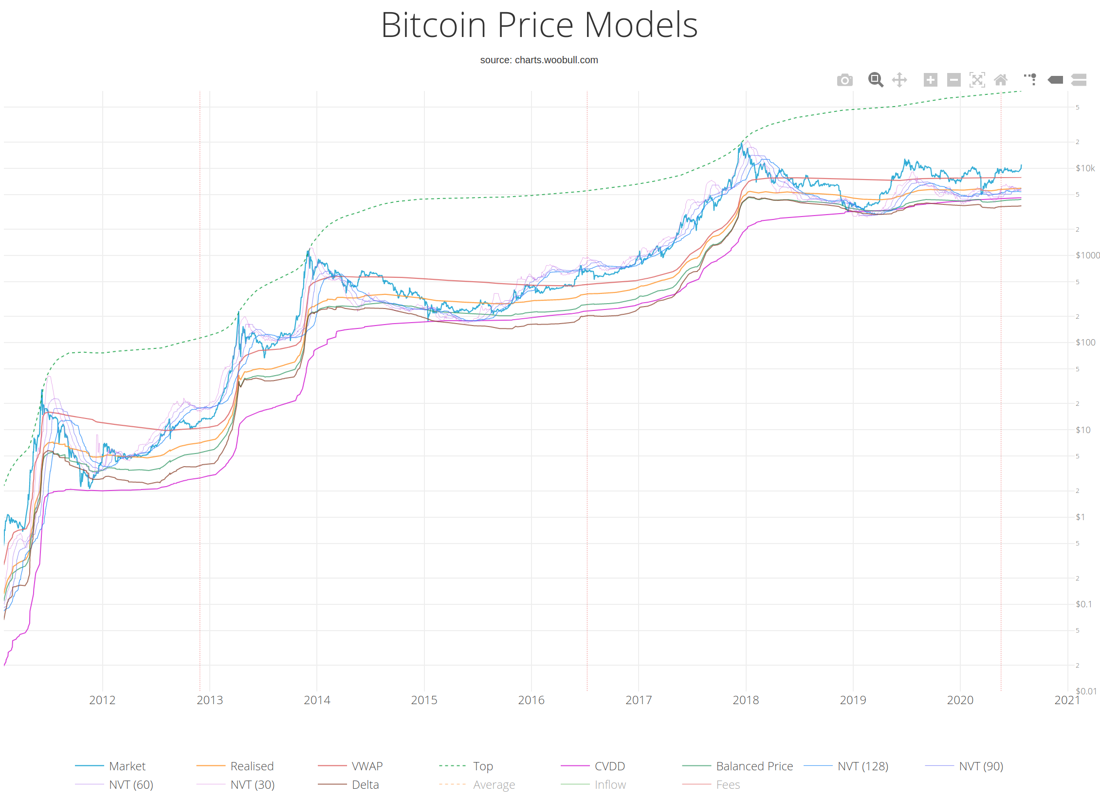
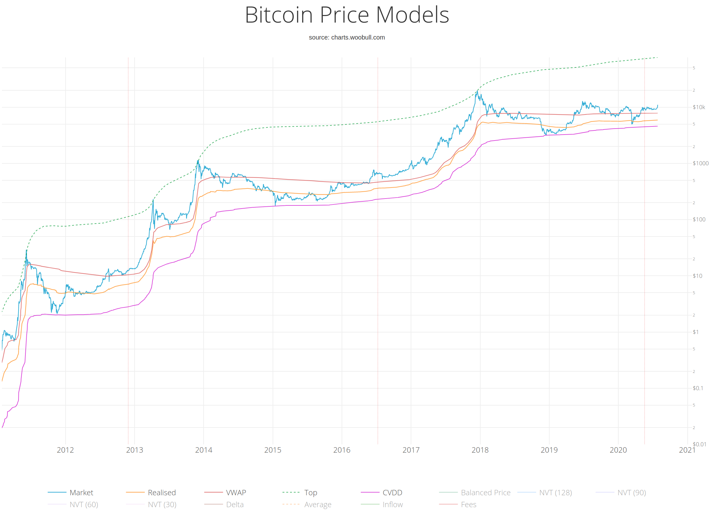
Let's have a glance at Willy Woo's Bitcoin Price Models on Charts.Woobull.com/bitcoin-price-models.
Countless other graphs (function diagrams) and charts (graphic representations of data) can be found on Woo's main domain.
[FA]
Let's have a glance at Willy Woo's Bitcoin Price Models on Charts.Woobull.com/bitcoin-price-models.
Countless other graphs (function diagrams) and charts (graphic representations of data) can be found on Woo's main domain.
- Top Cap : the calculated top
- CVDD : the calculated bottom
- VWAP : a calculated middle line
- Realised Cap : a lower calculated middle line
This data visualisation makes visible what professional traders and investors mean by their seemingly simple recommendation to "buy the bottom and sell the top". Just a few years ago, these kind of modelling tools were not publicly acccessible for the broader public – now they are.
A brief glance at this FA chart should reveal an attentive observer whether e.g. a long-term buy or sale will be good, bad or rather moderate.
- Top Cap : The average cap multiplied by 35. Historically has matched market tops (the average cap is the "forever" moving average of market cap. The cumulative sum of daily market cap values divided by the age of the market in days).
- CVDD : (Cumulative Value Days Destroyed) has historically picked the cycle bottom of the market. When coins pass from old investor to new investor, the transaction carries a USD value and also destroys an amount of HODL time by the previous holder. CVDD is the cumulative sum of this value-time destruction as a ratio to the age of the market and divided by 6 million as a calibration factor.
- VWAP : The volume weight average price, in other words an approximation of what the entire market paid for their coins using market price and on-chain volume.
- Realised Cap : The value of all coins in circulation at the price they last moved, in other words an approximation of what the entire market paid for their coins.
 [FA]
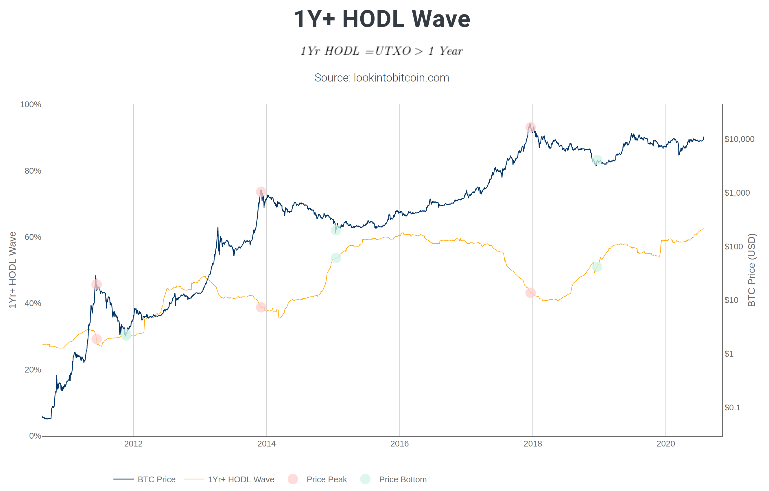
1Y+ HODL Wave is another network-data based FA metric resp. indicator which gives away clues about the market cycle resp. the market cycle's stages.
Indeed, it seems to be doing this very accurately – judging in retrospect at least.
[FA]
1Y+ HODL Wave is another network-data based FA metric resp. indicator which gives away clues about the market cycle resp. the market cycle's stages.
Indeed, it seems to be doing this very accurately – judging in retrospect at least.
The caption of the chart should be self-explanatory.
This screenshot originates from Philip Swift's platform Lookintobitcoin.com, a collection of learning tools for Bitcoin investing. It's an encyclopaedical library, be warned.
Every onchain-indicator on Swift's platform comprises a concise description, which is strongly recommended to be read.
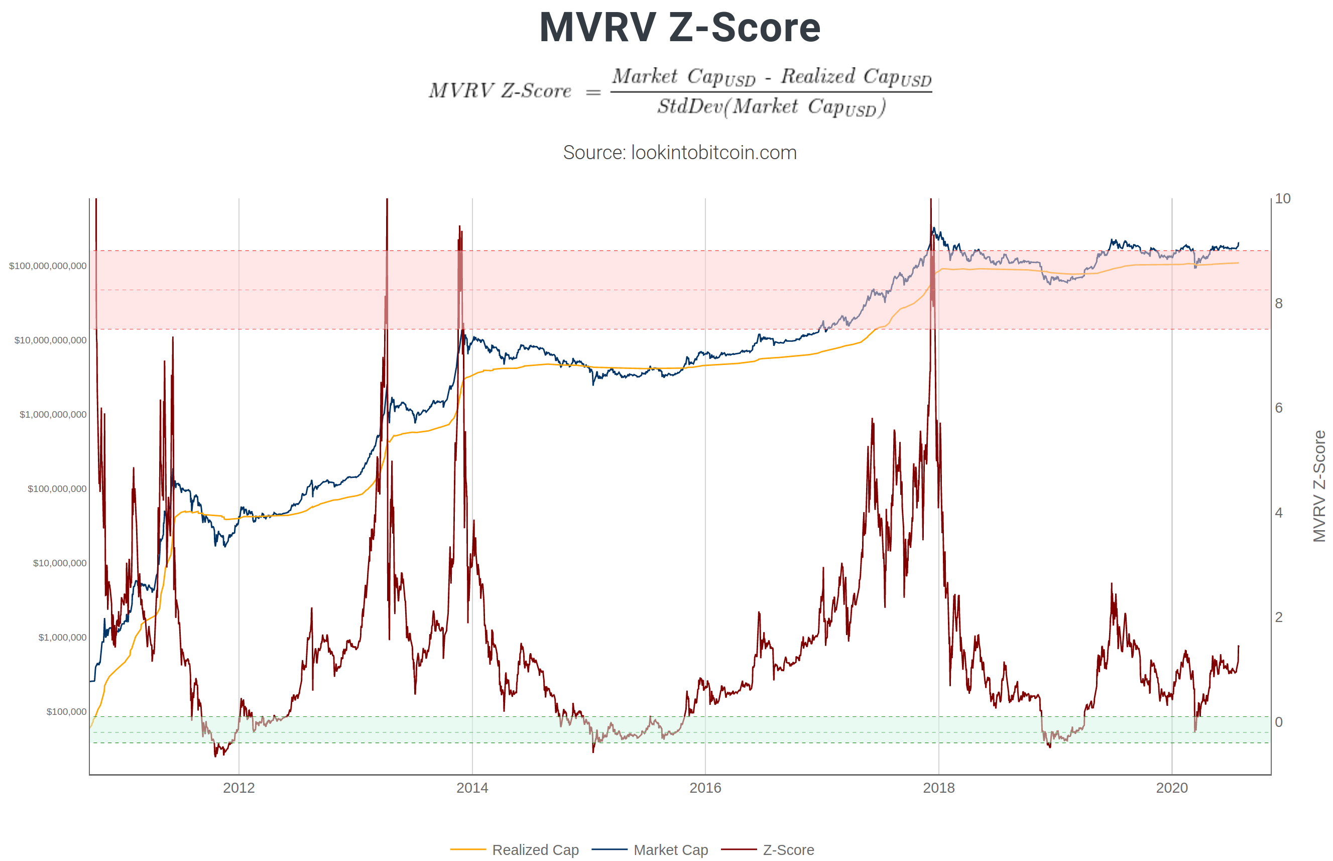 [FA]
MVRV Z-Score is yet another onchain-indicator which can give a user an additional source of confluence at hand.
After all, substancial variety is vital for optimal decision-making, or at the very least informed decision-making.
[FA]
MVRV Z-Score is yet another onchain-indicator which can give a user an additional source of confluence at hand.
After all, substancial variety is vital for optimal decision-making, or at the very least informed decision-making.
Descriptions for all FA metrics/indicators can be found on the aforementioned website.
 [FA]
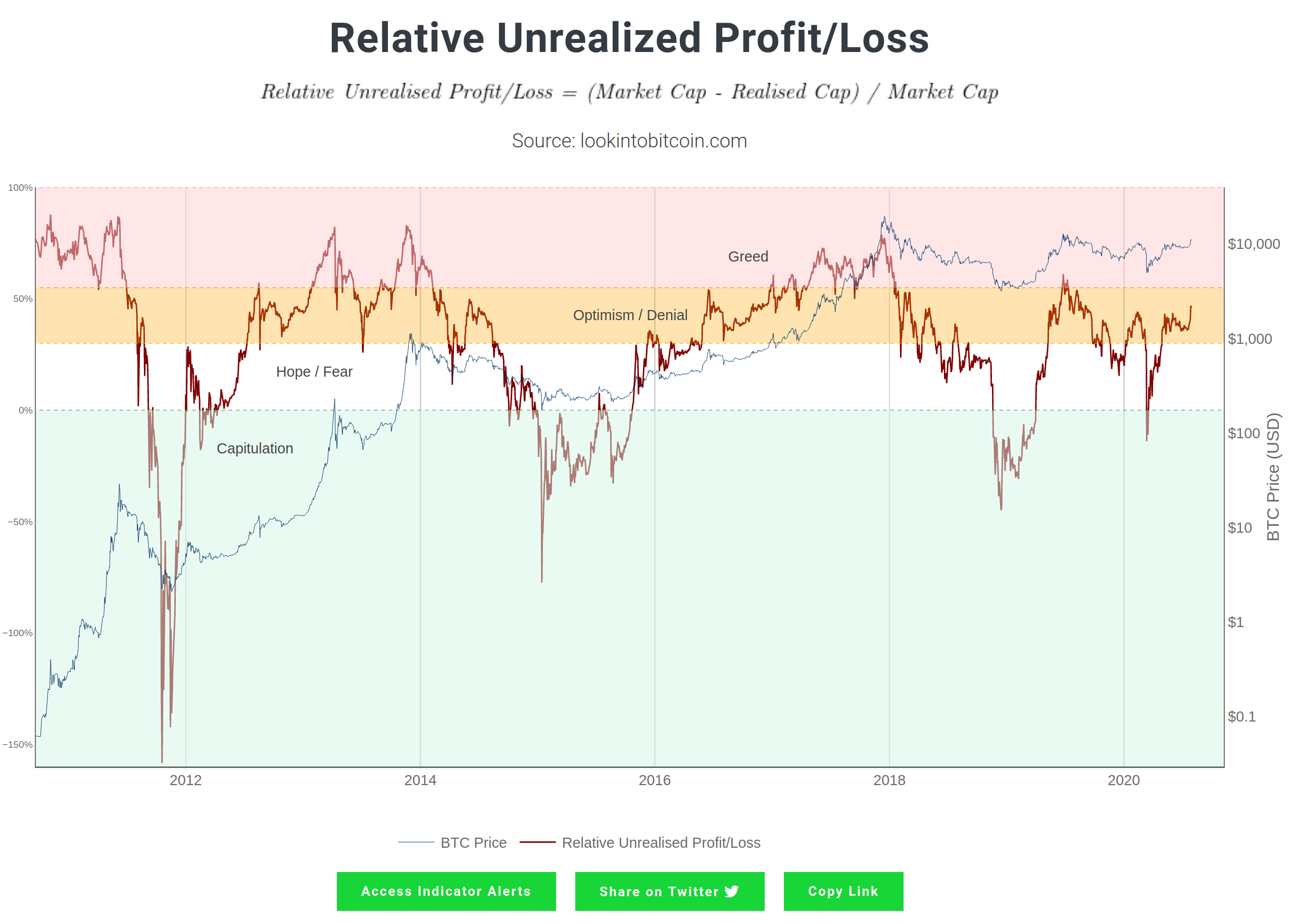
Purely for reasons of completion and especially market-cycle education: Relative Unrealized Profit/Loss,
described by Swift as an an onchain-indicator for investor sentiment market stages.
[FA]
Purely for reasons of completion and especially market-cycle education: Relative Unrealized Profit/Loss,
described by Swift as an an onchain-indicator for investor sentiment market stages.
A thorough understanding of the 4 general stages (accumulation, mark-up, distribution, decline) of a market cycle is of utmost importance for every category of trader (day, swing, positional as well as long-term investor/hodler) – apart from quantative traders (mostly high-frequency systems based on order books & order flows). Sentiments accompany each of these stages !
Many new market participants are welcomed by seasoned traders with a reference to the Wall Street Cheat Sheet, which conveys exactly this psychology of a full market cycle – from euphoria to capitulation back to euphoria.
 [FA]
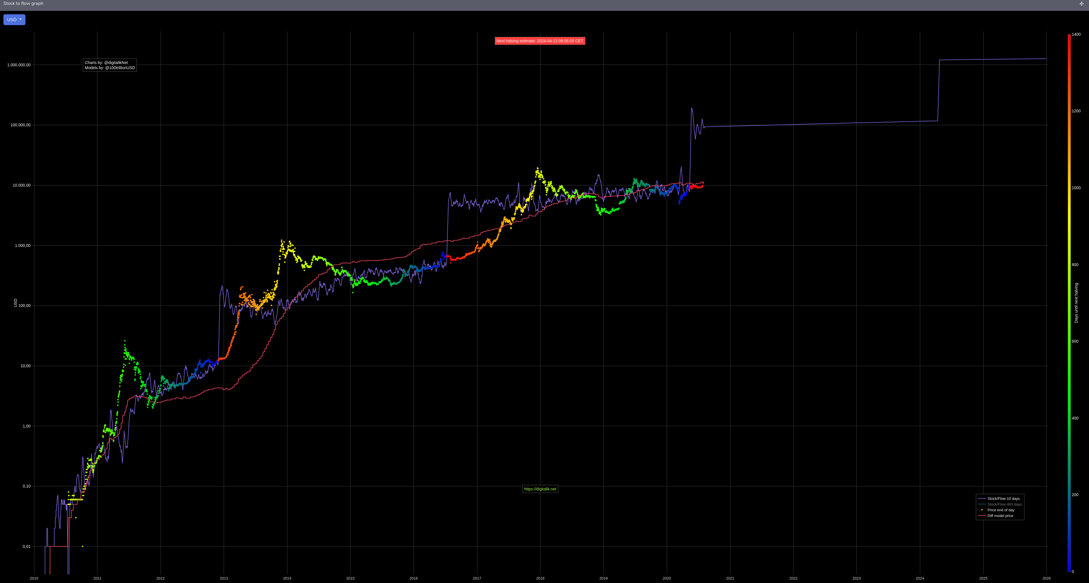
Another free source of visualised onchain-data (or network-data, here used synonymously) is Digitalik.net.
By default, this platform displays the often cited stock-to-flow (abbrievated as s2f) model for Bitcoin, which is linked to the halving events for this cryptocurrency.
[FA]
Another free source of visualised onchain-data (or network-data, here used synonymously) is Digitalik.net.
By default, this platform displays the often cited stock-to-flow (abbrievated as s2f) model for Bitcoin, which is linked to the halving events for this cryptocurrency.
The halving is a technical, hardware-related term which expresses a 50% reduction of mining rewards at a predefined time (blocktime, to be precise). A thorough explanation is beyond the scope of this article though.
In the graph of the s2f function (purple), the halving can be detected at the points the price line turns into dark red.
![]() [FA]
Realtime data is often more worth than formulae. Latter have a tendency to lag behind, even when sourced from a highly active network.
[FA]
Realtime data is often more worth than formulae. Latter have a tendency to lag behind, even when sourced from a highly active network.
Blockchair.com – which describes itself as universal blockchain explorer and search engine – provides a rainbow-spectrum of functions and almost infinite parametrisation. As if that alone were not magnificient enough, they offer whole blockchain database dumps for downloading.
Blockchair.com/bitcoin > Charts > Transaction volume (USD) gives any curious person on earth an idea, how much Bitcoin (expressed in USD) currently is or historically has been transacted.
![]() [FA]
For statisticians, mathematicians and the like, analysing the average transaction volume / amount (in USD) is a powerful means to understand whether bigger
players or even so called whales are active.
[FA]
For statisticians, mathematicians and the like, analysing the average transaction volume / amount (in USD) is a powerful means to understand whether bigger
players or even so called whales are active.
![]() [FA]
The median transaction volume / amount (in USD) is, typically, indicative of smaller (~mediocre) market participants.
[FA]
The median transaction volume / amount (in USD) is, typically, indicative of smaller (~mediocre) market participants.
 [FA]
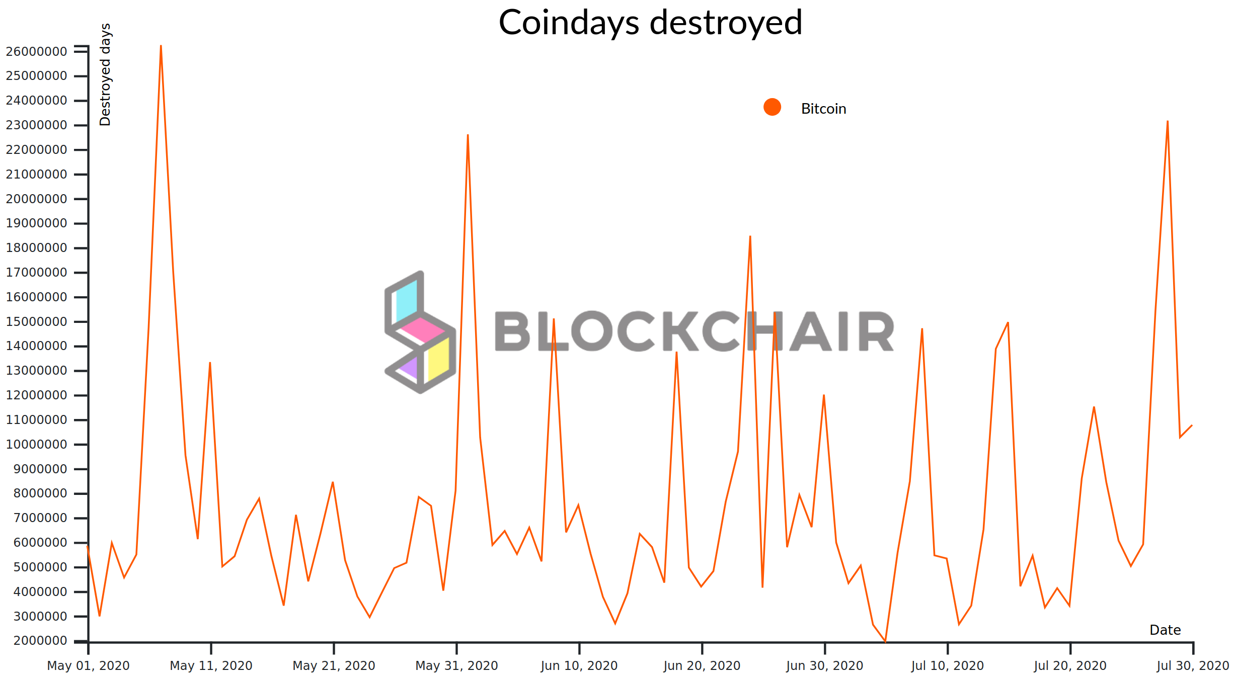
Coindays Destroyed (CDD) however is a fairly sophisticated measure to detect when larger amounts of old (i.e. held for a long time) coins have moved. In this case,
we're focussing only on Bitcoin.
[FA]
Coindays Destroyed (CDD) however is a fairly sophisticated measure to detect when larger amounts of old (i.e. held for a long time) coins have moved. In this case,
we're focussing only on Bitcoin.
Coin Days Destroyed (CDD) is a measure of economic activity which gives more weight to coins which haven't been spent for a long time. It is considered an important alternative to looking at total transaction volumes, which may not accurately represent economic activity.
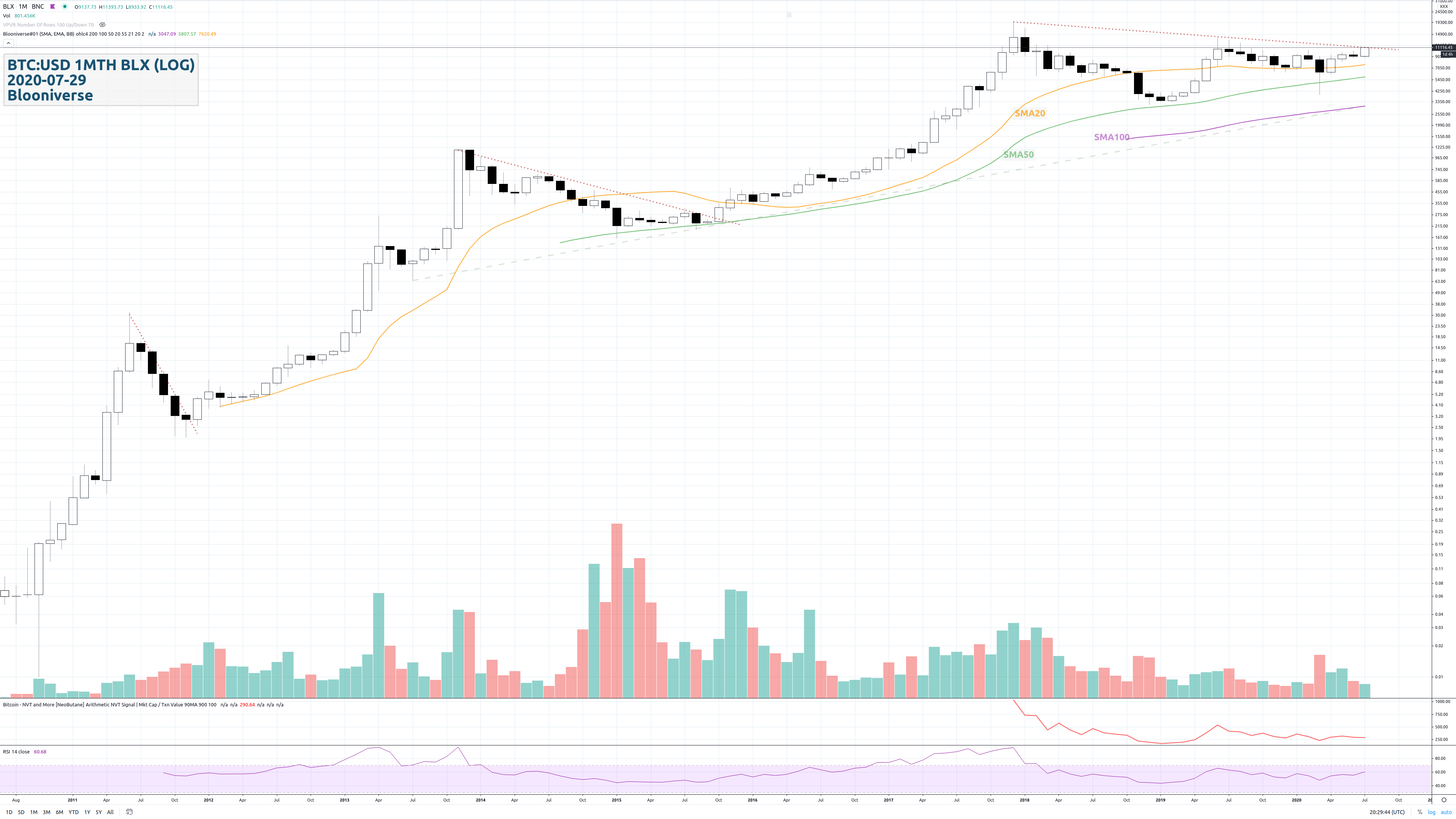 [TA] BTC:USD 1MTH BLX (LOG)
The monthly chart on the logarithmic scale (open in a new tab): The three dotted red downtrendlines (counter-trendlines) each starting from their
respective all-time high (mid-2011, EOY 2013, EOY 2017) may serve as an indication for the current situation – note their ever increasing
angle (i.e. flattening market).
The price currently trades above the SMA 20 (simple moving average), which is interpreted as bullish sign. The SMA 100 (almost parallel to the dashed grey bottom line starting mid-2013) doesn't play a significant role at this point.
The two oscillators (oscillating indicators) on the chart are, from the bottom up: the momentum indicator RSI (with default parameters) and the FA metric NVT Signal (arithmetic method) – a metric derived from dividing the market capitalisation by the smoothed out daily transaction value). Sometimes, the latter is called the P/E ratio (price to earnings) of cryptocurrencies.
Remark: The BraveNewCoin Liquid Index for Bitcoin (a price feed with the ticker BLX) closes on the previous day.
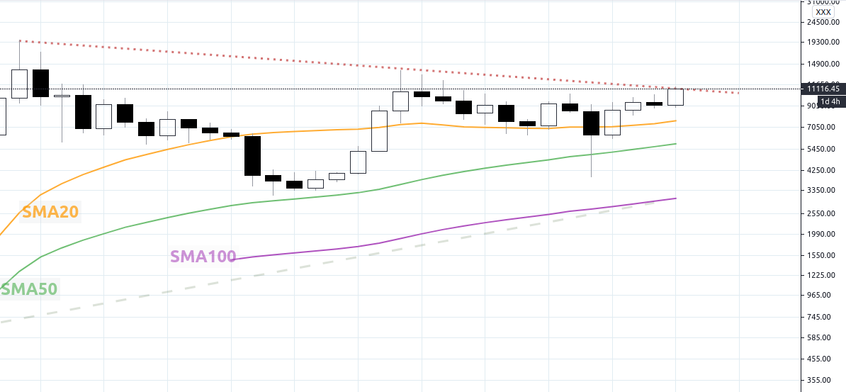 [TA] BTC:USD 1MTH BLX (LOG)
Zoomed in: a monthly close above roughly USD 10'950 could or rather would be interpreted as a bullish sign – presumably in the context of
fiat-money wealthy long-term investors.
The monthly formation vaguely resembles a Cup & Handle – on the linear chart more distinctly than on the logarithmic chart.
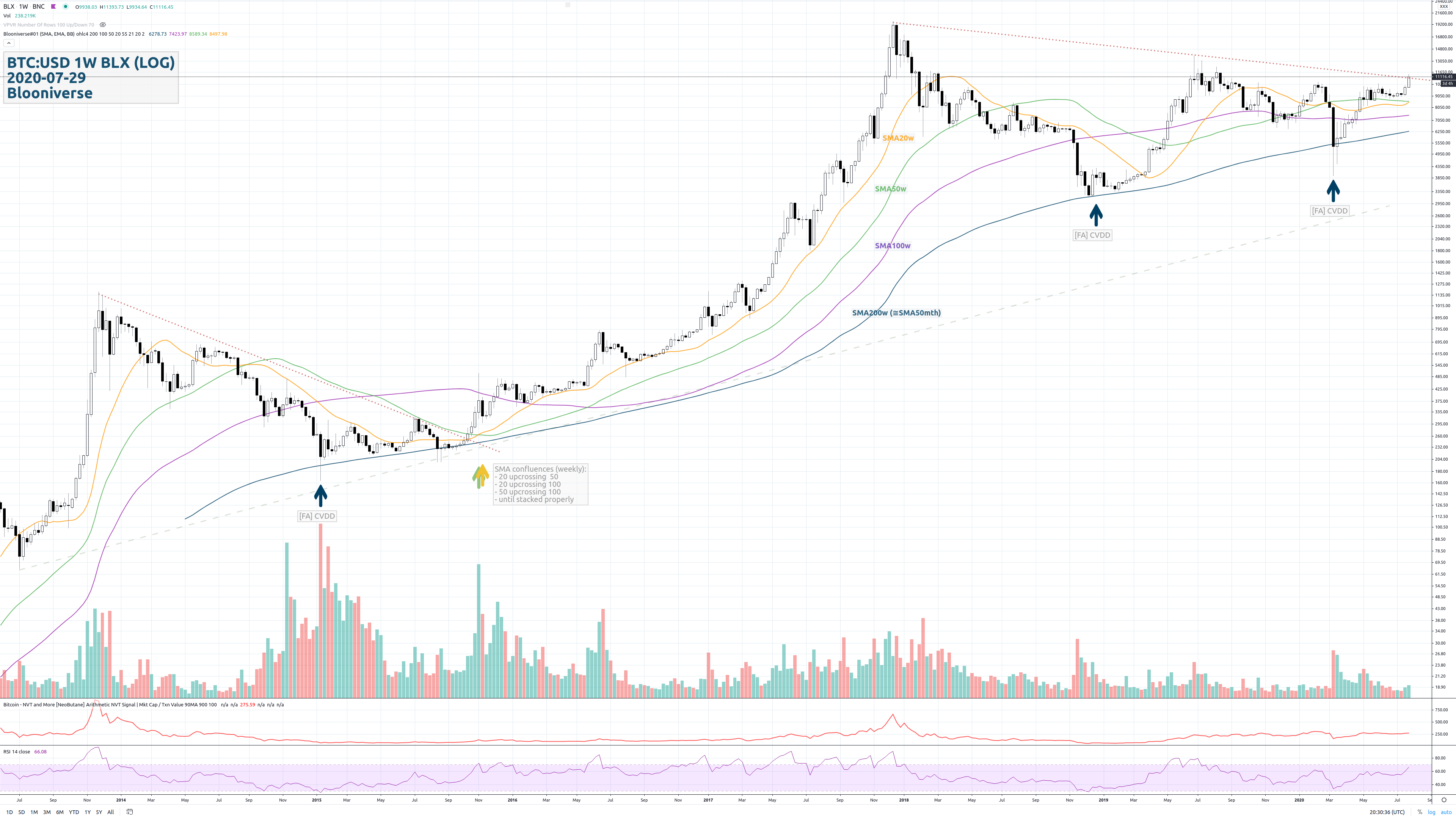 [TA] BTC:USD 1W BLX (LOG)
On the weekly timeframe chart, there's finally a proper stacking of all the essential moving averages (SMAs – the EMAs and WMAs are already stacked right)
coming into place.
The two oscillators (oscillating indicators) on the chart are, from the bottom up: the momentum indicator RSI (with default parameters) and the FA metric NVT Signal (arithmetic method) – a metric derived from dividing the market capitalisation by the smoothed out daily transaction value). Sometimes, the latter is called the P/E ratio (price to earnings) of cryptocurrencies.
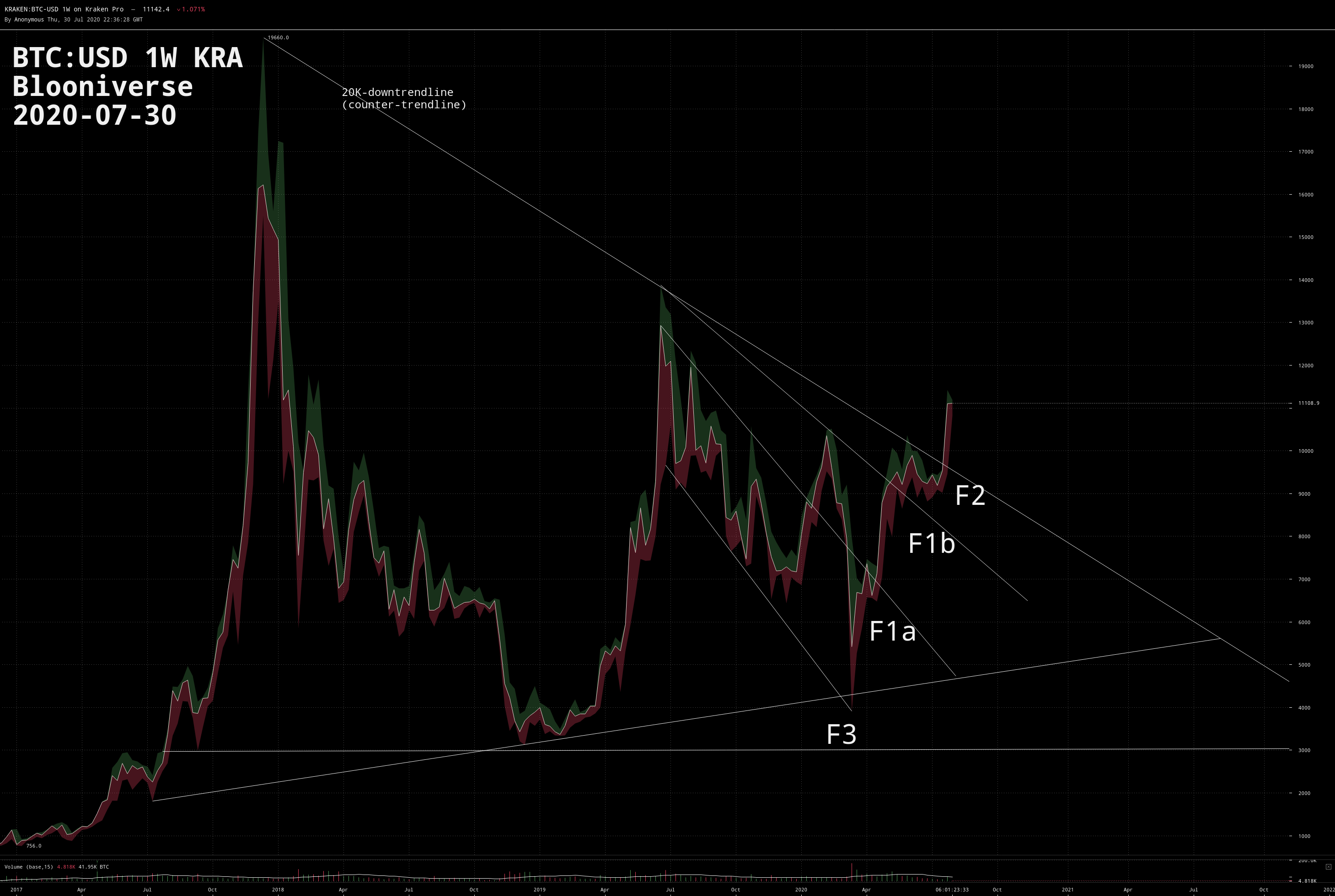 [TA] BTC:USD 1W KRA
Formation F1a is/was a bullish (i.e. positive) channel down (downtrend-channel). Formation F1b is/was some form of megaphone resp. broadening formation, regardless of whether F1a's upper boundary (trendline) is used as its lower
boundary or not often a sign of inconclusiveness. And F2 is an extremely bullish multi-year triangle-pennant ! The extremely bearish (negative) F3 formation, a multi-year descending
triangle, fortunately hasn't come to fruition so far – mid-March the price was briefly entering F3 though, but clearly bounced back from the CVDD (see explanation in the FA section).
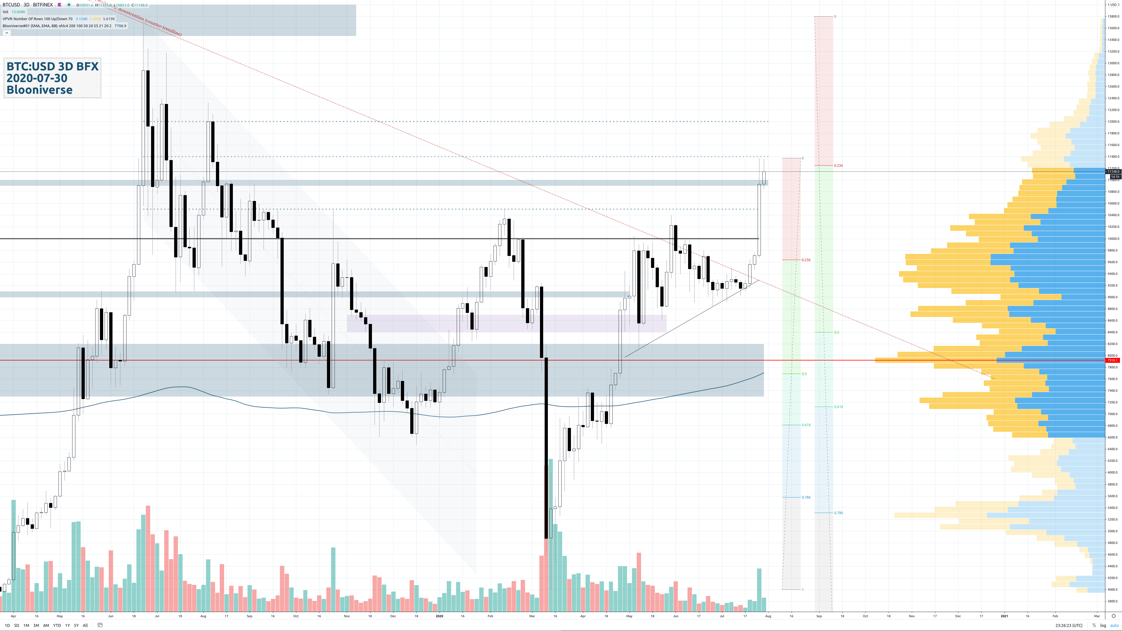 [TA] BTC:USD 3D BFX
Working chart with volume-profiling (VPVR) since April 2019 and, consequently, a point of control (red line) of roughly USD 7900. The Fibonacci retracement levels (depicted as vertical, multi-coloured bars on the very
right side) indicate possible targets in the case of a correction.
Whereas horizontal dotted blue lines express less significant levels (can be broken easier), horizontal thick blue lines or bars indicate more significance (stronger support and/or resistance).
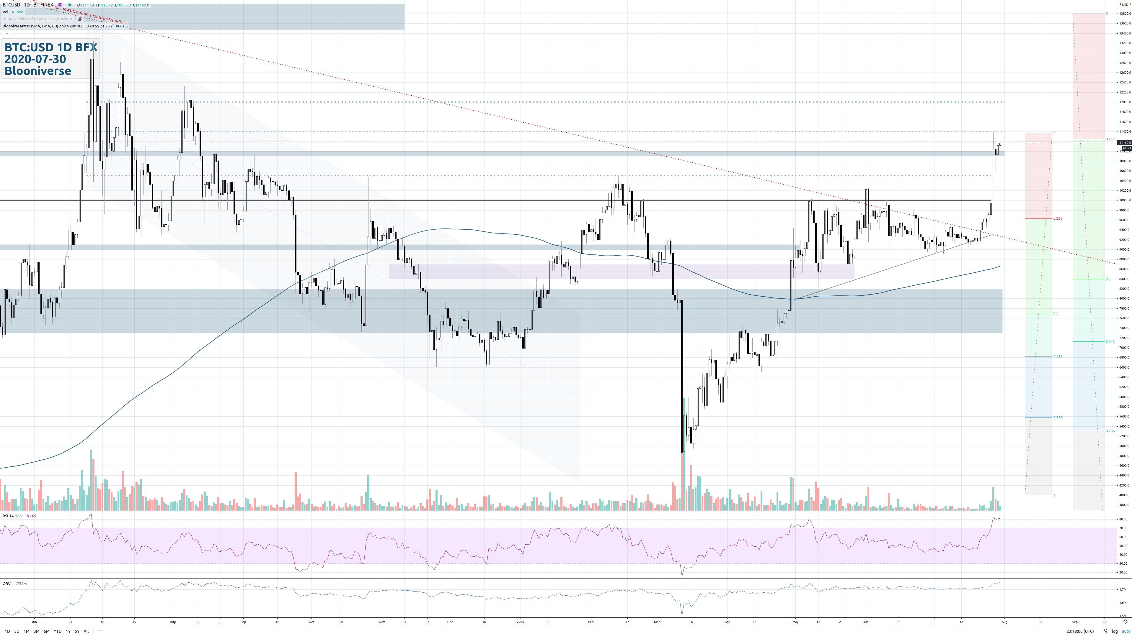 [TA] BTC:USD 1D BFX
Same working chart on a shorter/lower timeframe (1 day intervals) and without volume-profiling. In addition, two oscillating indicators can be found at the bottom of the chart: the RSI (Relative Strength Index with default settings) and
the OBV (On Balance Volume with default settings).
The horizontal dark grey line is the psychologically important 10K border.
On all charts, the wavy line in dark blue is the SMA 200 (simple moving average, 200 period).
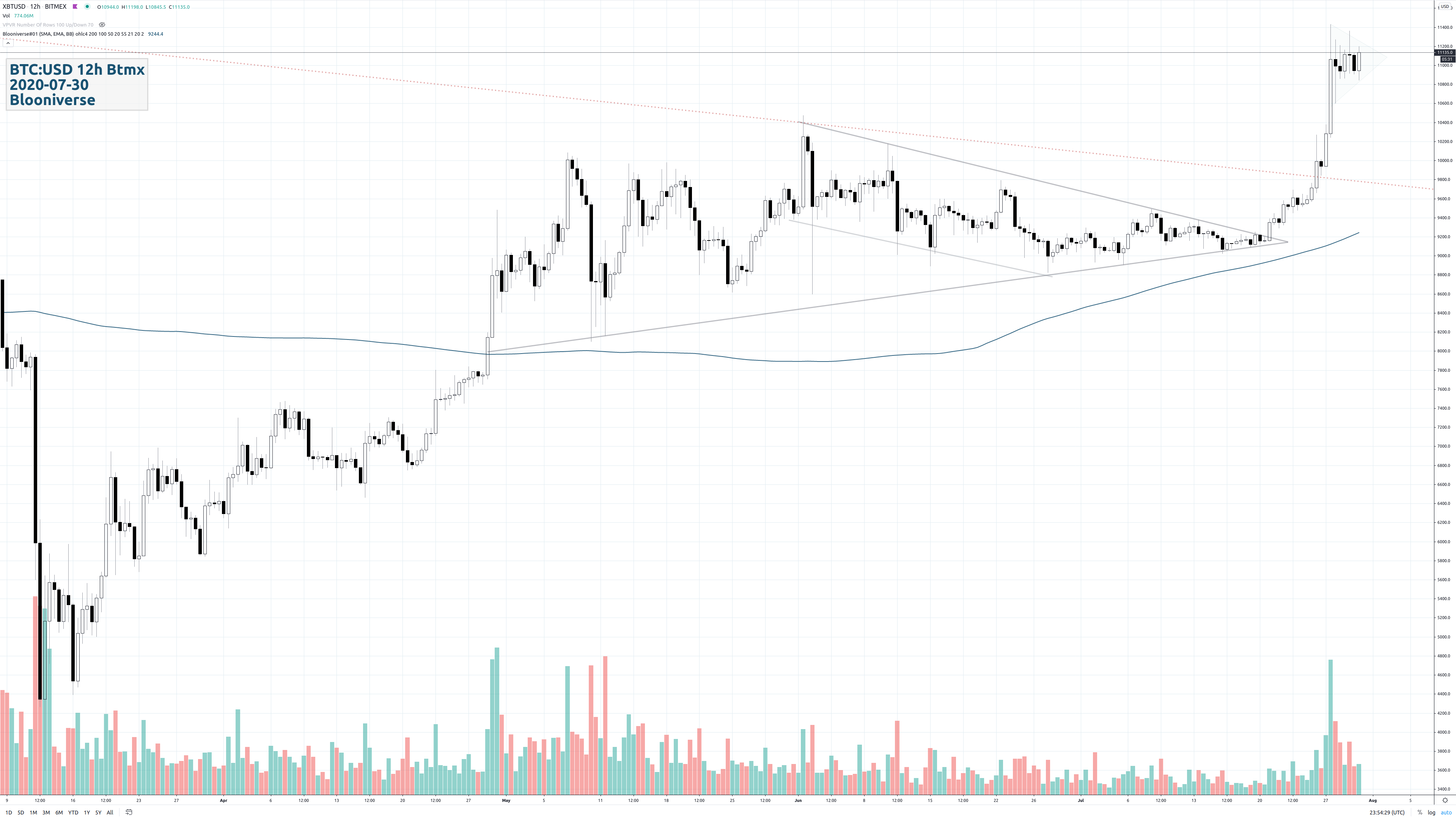 [TA] BTC:USD 12H BTMX
Current formations: On the 12 hourly timeframe chart, we're seeing the price having broken out of a multi-month pennant formation, integrating a downtrending channel towards its end.
Both are considered continuation formations (or patterns) – in this case bullish ones because the price usually continues in the direction it came from before entering the continuation pattern.
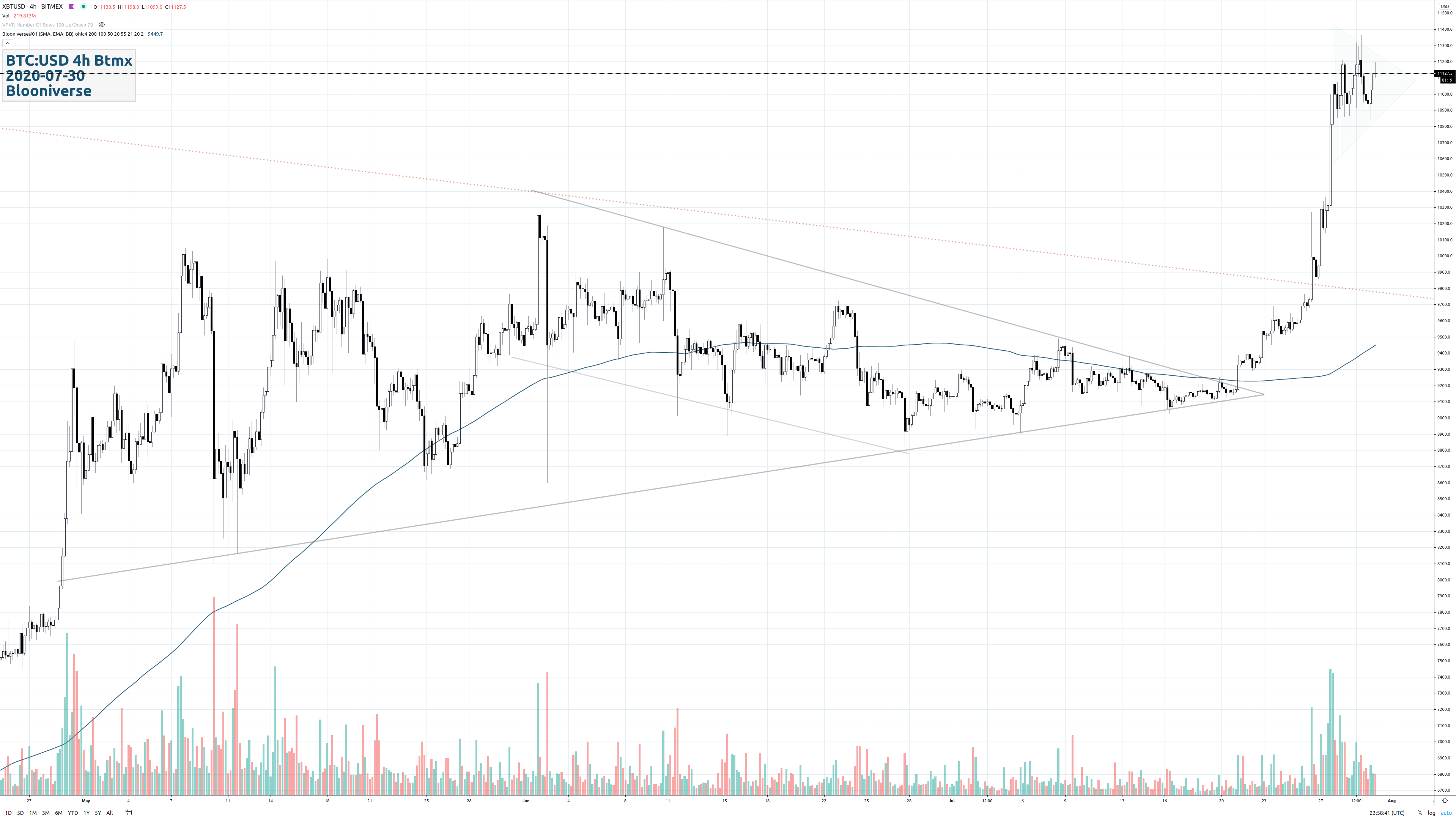 [TA] BTC:USD 4H BTMX
Having zoomed in a bit closer, we can already see the next, most current pattern forming: some form of triangle! Understanding triangles and pennants as continuation patterns, this would be considered as bullish.
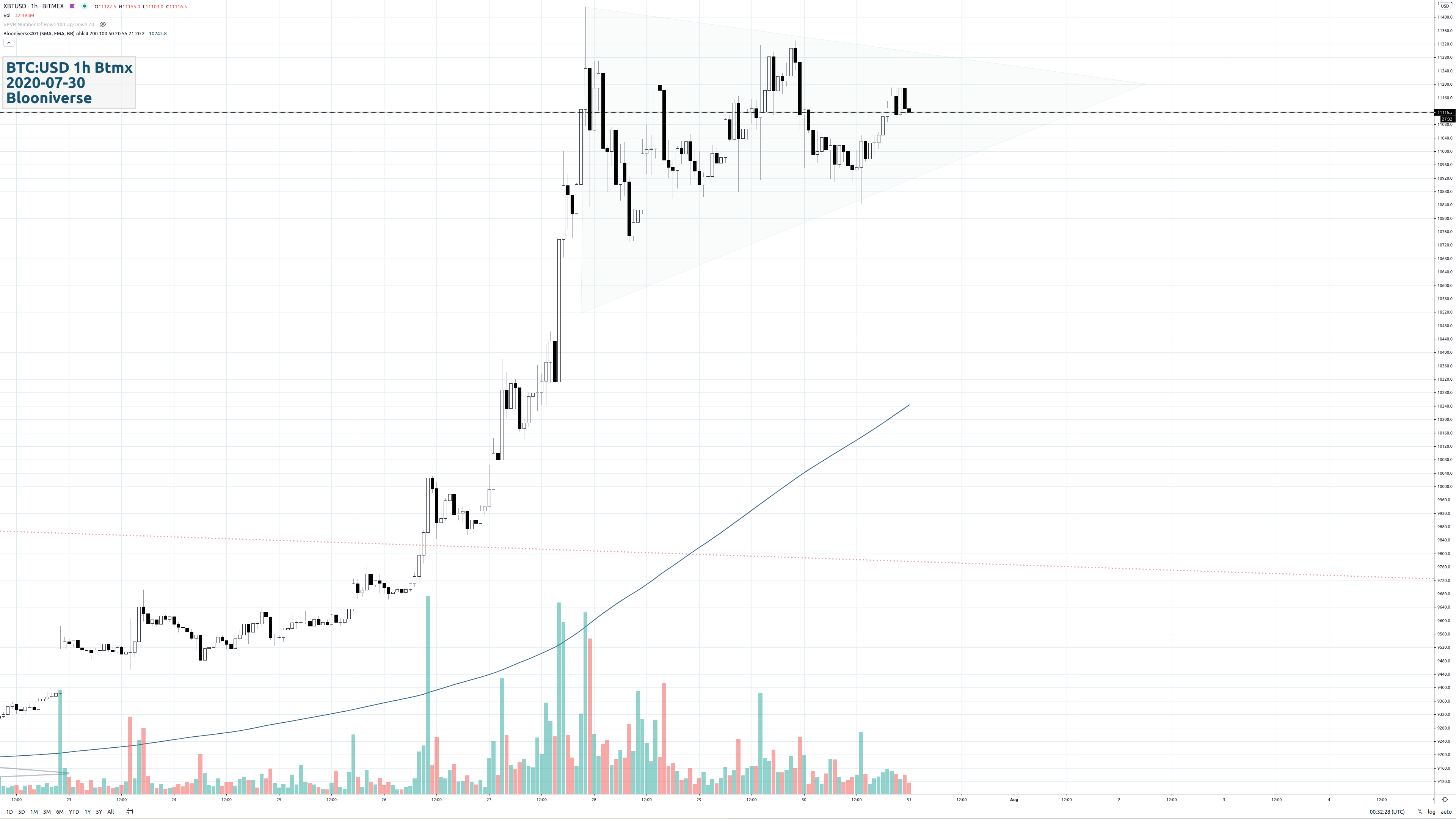 [TA] BTC:USD 1H BTMX
Connecting the candle-wicks results in a triangle or pennant formation (coloured in feeble turquoise).
Although the case for an ascending triangle could somehow be made by omitting the first upper wicks (upper shadows) and subsequently carving a straight horizontal line through some
following candles, the first drawing would be considered kosher and correct.
The wavy dark blue line below the price line is the SMA 200.
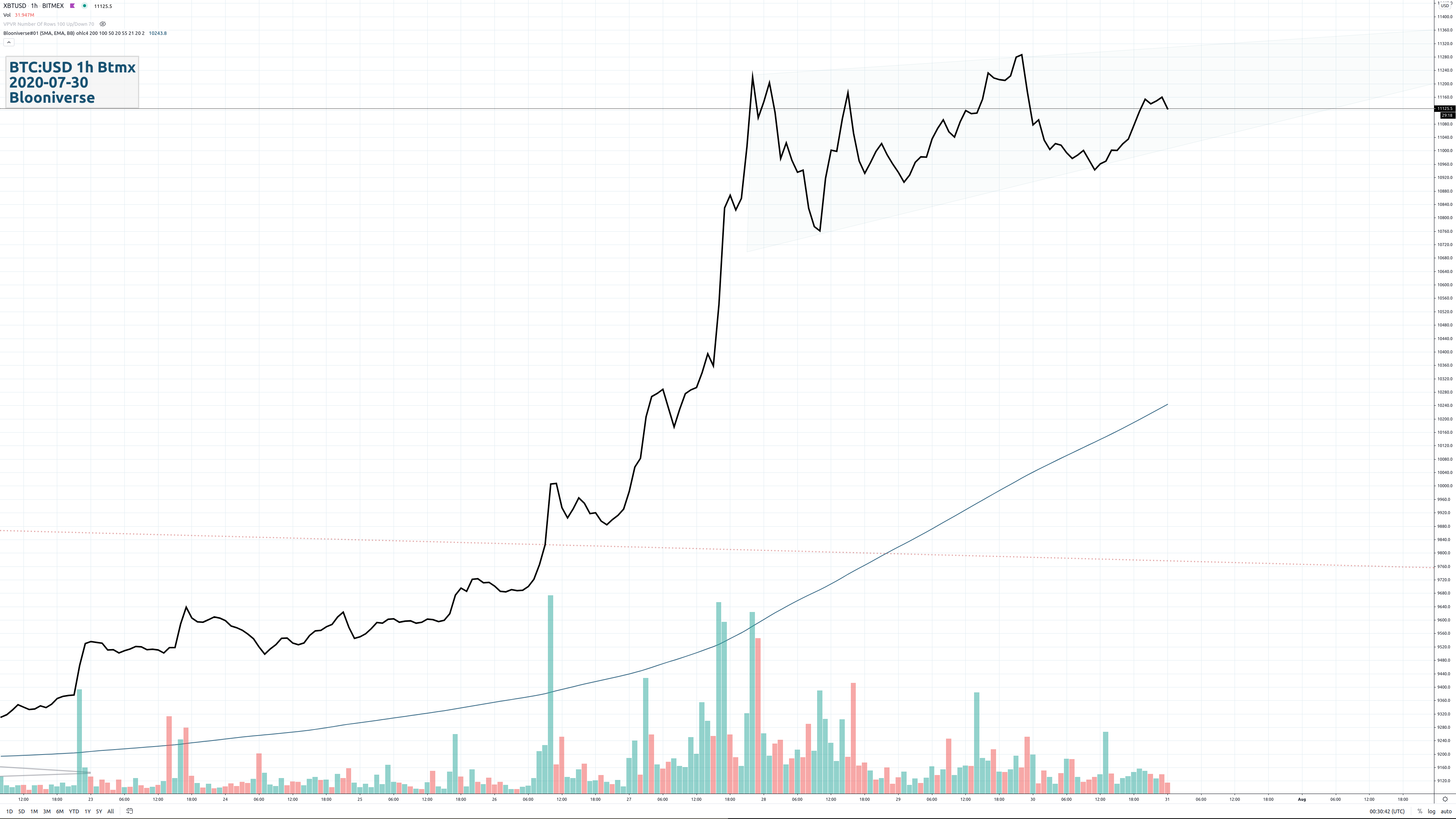 [TA] BTC:USD 1H BTMX
It's enlightening to see how the candle chart from above shows a different formation (in feeble turquoise) after switching to a line display (source: ohlc4):
now the formation occurs rather as a rising wedge.
Note that something similar happens when mereley the candle bodies are used for drawing.
The wavy dark blue line below the price line is the SMA 200.
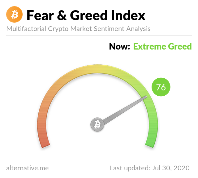 [SA]
The sentiment has been oscillating between greed and extreme greed since a few days (lagging indicator).
[SA]
The sentiment has been oscillating between greed and extreme greed since a few days (lagging indicator).
The crypto market behaviour is very emotional. People tend to get greedy when the market is rising which results in FOMO (fear of missing out). Also, people often sell their coins in irrational reaction of seeing red numbers. With our Fear and Greed Index, we try to save you from your own emotional overreations. There are two simple assumptions:
- Extreme fear can be a sign that investors are too worried. That could be a buying opportunity.
- When investors are getting too greedy, that means the market is due for a correction.
Data source categories named are: volatility, market momentum/volume, social media, surveys (currently paused), Bitcoin dominance and Google trends.
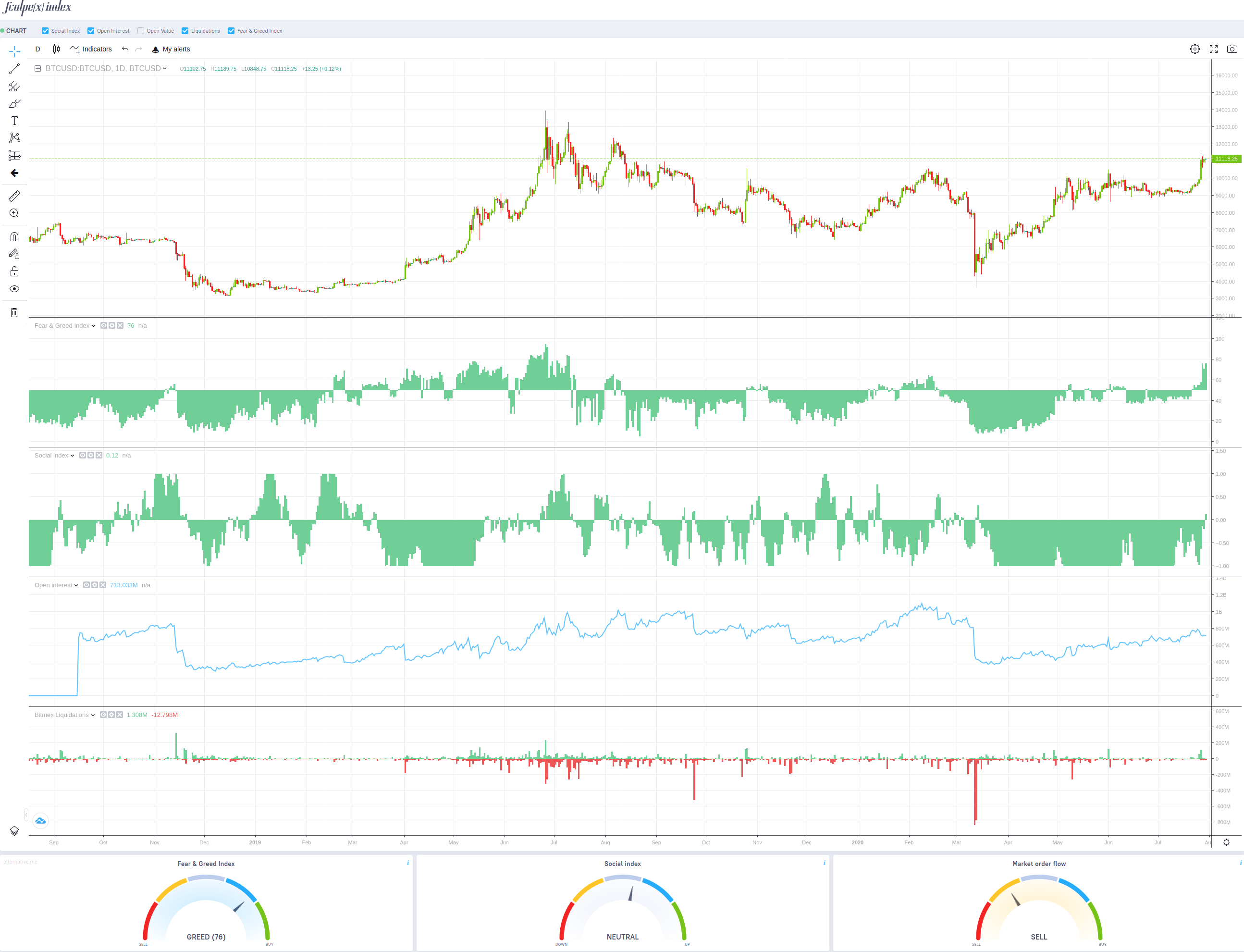 [SA]
Scalpindex.com provides an all-in-one display which aggregates various sentiment feeds. Altough these are listed below and documented in form of a screenshot, their in-depth
explanation will have to be given in follow-up articles due to reasons of brevity.
[SA]
Scalpindex.com provides an all-in-one display which aggregates various sentiment feeds. Altough these are listed below and documented in form of a screenshot, their in-depth
explanation will have to be given in follow-up articles due to reasons of brevity.
- Fear & Greed Index
- Social Index
- Open Interest
- Bitmex Liquidations
Trader specific sentiment data can also be found on resp. derived from: Skew.com, Datamish.com, Tensorcharts.com, Cryptorank.io and Bitgur.com.
 [SA]
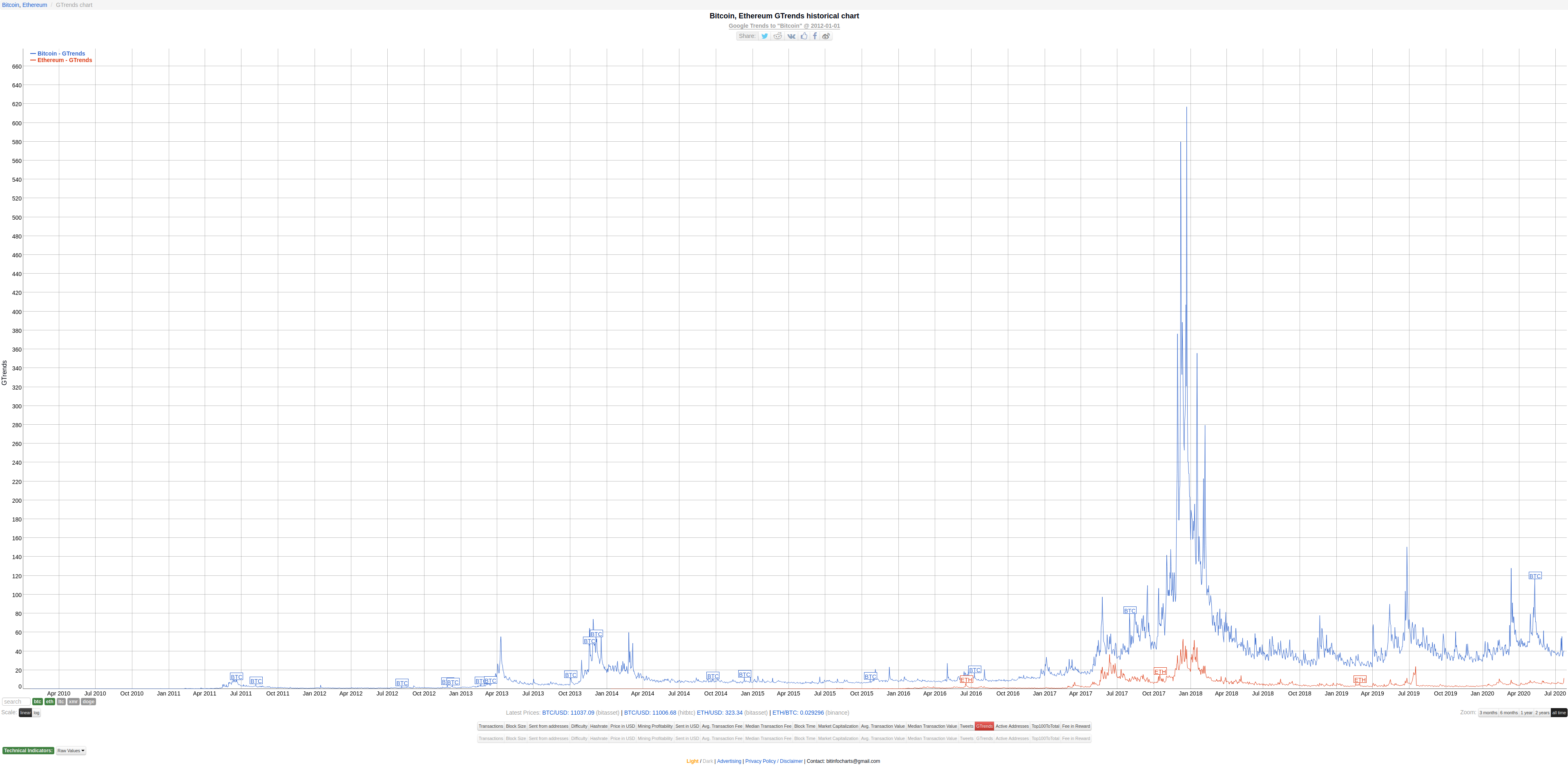
Google Trends for Bitcoin and Ethereum – usually, these trend plots are used in a contrarian way: the greater the public interest, the higher the risk.
No further comments at this point.
[SA]
Google Trends for Bitcoin and Ethereum – usually, these trend plots are used in a contrarian way: the greater the public interest, the higher the risk.
No further comments at this point.
Source: Bitinfocharts.com.
[MA] Grasping the intricate interwovenness of the world in regards to the economy, especially the financial markets, is called macro analysis. It's an expertise of its own – requiring a synthesis of associative intelligence and the skill to add up numbers.
Since it is strongly recommended to follow highly-skilled masters of this field on a regular basis, this section shall mainly refer to two macro economic analysts and traders who – thanks to their open-mindedness – have also been covering cryptocurrencies since many years:
- Alessio Rastani: Youtube.com/alessiorastani
Nicholas Merten: Youtube.com/DataDash
Here embeded you find two current streaming videos from Nicholas Merten. Alessio Rastani provides extensive premium videos for his subscribers on his website Leadingtrader.com only.
 [MA]
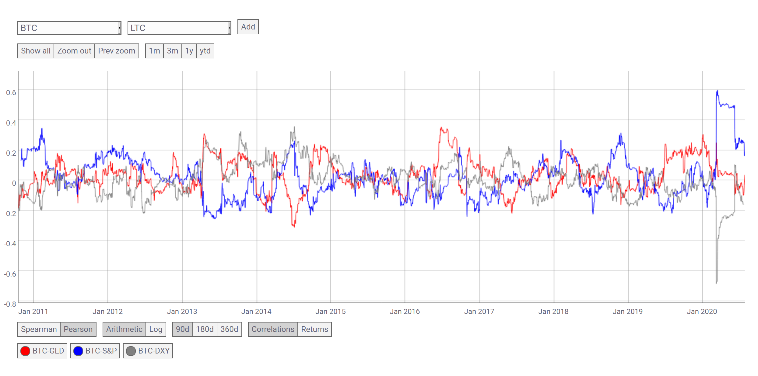
Correlation charts by Coinmetrics.io (publicly, there is only 90d ma smoothing available, unfortunately; less time would have been far more accurate resp. timely).
[MA]
Correlation charts by Coinmetrics.io (publicly, there is only 90d ma smoothing available, unfortunately; less time would have been far more accurate resp. timely).
- Bitcoin : Gold
- Bitcoin : S&P 500 Index
- Bitcoin : DXY (U.S. Dollar Index)
Remark: correlations can be very dynamic, thus highly deceptive. Many regular people believe a correlational ratio will remain at a certain point for a long time – this is utter nonsense.
 [MA]
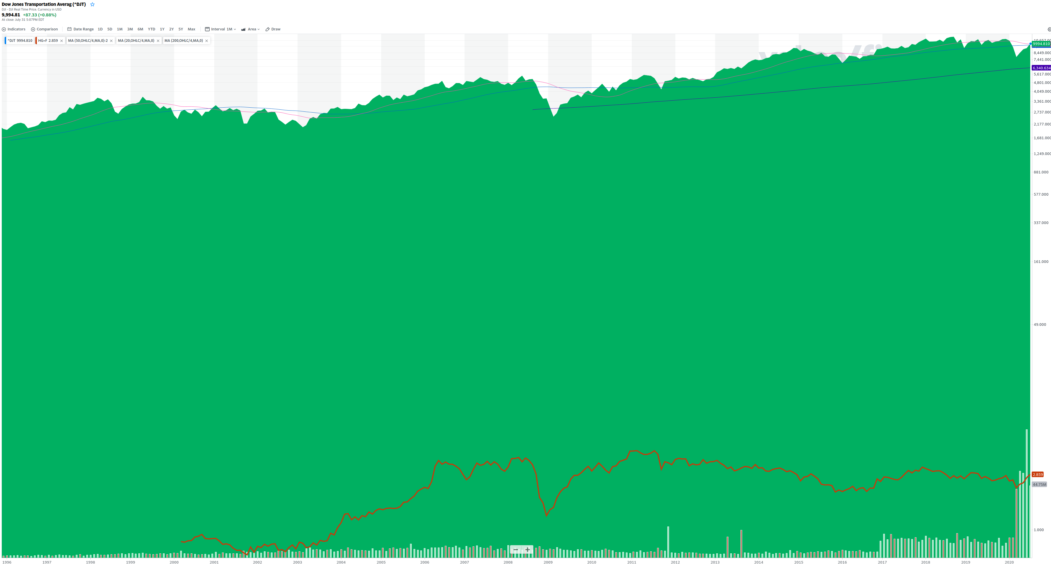
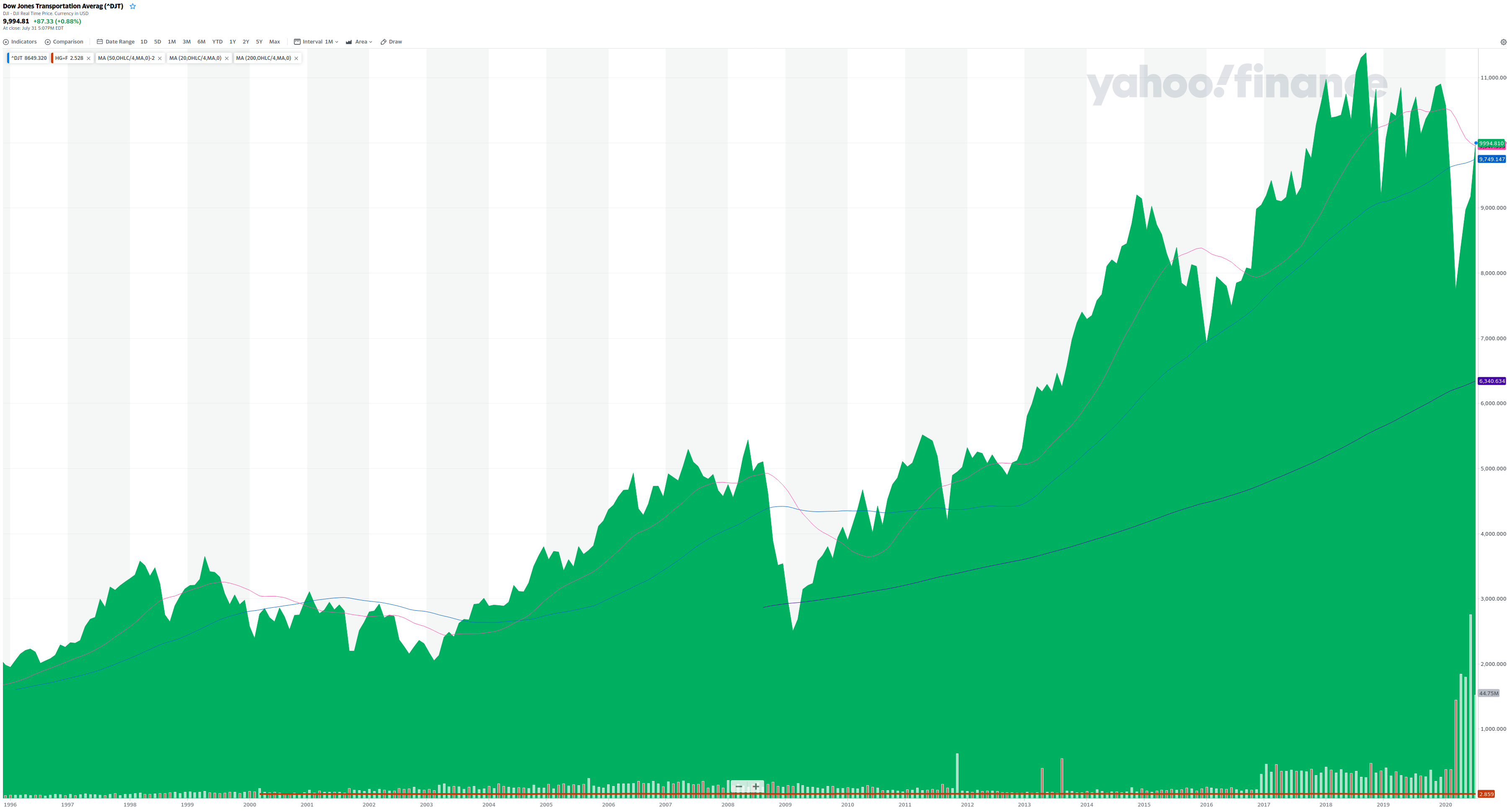
The two Yahoo Finance charts each show the Dow Jones Transportation Average index in combination with copper (reddish brown line) – both are considered to be leading indicators (in contrast to the vast majority of lagging indicators).
[MA]
The two Yahoo Finance charts each show the Dow Jones Transportation Average index in combination with copper (reddish brown line) – both are considered to be leading indicators (in contrast to the vast majority of lagging indicators).
Following moving averages (SMA) are used: 200mth, 50mth and 20mth (monthly timeframe). The first chart's scale is set to logarithmic, the second to linear.
Warning: A sustainable, solid market assessment can easily consume days or weeks of work due to the requirement of constantly examining a broad spectrum of complex and dynamic information.
Not tackled here are:
- Call/put ratio of stonks (stock market).
- Seasonality of markets.
- Questioning the permabull attitude of nonlinear regression.
- Global black swan events, white swan events.
- Planetary issues with PoW (proof of work) mining like e.g. energy waste (linked to electricity prices).
- Planetary issues with PoW coins in general in regards to hardware resources.
- Etc. etc. etc.
[UX] Open the screenshot graphics in a new browser tab (context menu) or download them in order to see them in high resolution (UHD1).
[LEGAL] The information contained in this article (or on this website) is of a general nature and intended as a guide only. It is neither to be construed as financial advice nor to be regarded as a definitive analysis of any financial, legal or other issue.